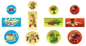
How the funny and original Micro Monsters’ creatures were created? The game’s illustrator, Francesco Mattioli unveils his creative process, step by step, from the first drawings to the final layout of the four races. He wrote his notes, naturally using many sketches to show the different stages of his work on the game.
"When Francesco Nepitello and Marco Maggi got in touch with me to illustrate their Micro Monsters game, I was immediately hooked. Drawing pocket monsters… I love it! That’s what I would like to do every day! But it’s not so easy as it seems, especially when you don’t have a previous concept and you don’t have strong boundaries to your imagination.
You can do everything you want, but it’s not easy to catch the right spirit!
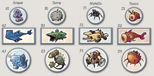
So, I started by defining the overall graphic style and the concept for each of the four “races” included in the game, each composed by 3 different creatures.
The starting directions indicated that the four races should be inspired by the four “classical” elements: Earth, Fire, Water and Air. But it was only a starting suggestion, open to be modified if some more original idea came across. First, I was inspired by some little monsters I’ve created to present my personal portfolio as an illustrator, which was mixed with some inspiration drawn from the Gormiti, given that my friends’ sons were crazy for them.
Generally the style was more “serious” and realistic (if it’s possible to use such a word for monsters...) compared to the final outcome. We agreed that we should be doing a sort of alien “animaloids”, not human-like beings or classic fantasy creatures.
The most difficult part in doing this kind of jobs is to find the right “shape” for your characters. Everything may work, from rocket snails to winged mice... but not always the things that work in theory turn out to be so nice when put on the paper. What is really important it’s that the monsters look friendly and funny.
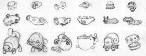
So, I decided to draw a lot of monsters! I did a new sketch every time I got a good idea, but I’ve also drawn many dozens of little monsters almost at random, then looking at them to find what was better-looking. During this process, I filled page after page with microscopic little pets, with most of them being immediately discarded to the trash can!
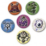
However, after some tests and receiving Nepitello’s feedback, I “adjusted the aim” and created a first selection choosing as themes Water, Earth, Metal and Fire. Among the tests there were also races inspired to Forest, Air, Earth (another one!), Jelly (!)... so, a wide range of choices with some of them which we really liked.
Personally I wasn’t fully satisfied by the Fire monsters: they were less vivid that the others and one was really too much similar to a “Monster Allergy” creature. Meanwhile the tests were perfect to show the demo game around the game fairs, so we decided to stop the tests, waiting for some feedback from potential publishers.
After several months, the answers arrived: the game was appreciated and it would be produced, hurrah! But we had to change the design style of the monsters, because everybody judged it too serious for the target audience, and the style of game. Fabio Maiorana (the graphic designer working on the game) had sent me a lot of interesting references, and I had especially appreciated the creations of Hiroshi Yoshii, so I went on to immediately draw a new test, keeping in mind his style, which was immediately appreciated!
While I had nailed down which was the right style to follow, I still had to give shape to the little monsters. And I started again to draw dozens of creatures. The monsters did not just have to be funny! They had to have some common features that made them recognizable as a "family". The first to receive a warm welcome were the “winged fishes”, now called Finbacks.
Expanding from this concept, we decided that every race should have animal characteristics merged with some “additional feature”: we now knew which was the key to develop the series, but we still had to find enough good ideas!
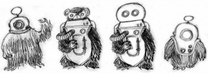
The second approved race were the “mechanic bears”, now called BigBears, derived directly from other sketches that I had done for another monster game by Nepitello, and inspired by Ro-Man, a crazy alien from Robot Monsters, one of my favorite B-movies.
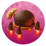
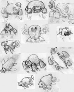
Afterwards, I had the idea of the “wheeled crocodiles” (the Autogators), and last came the “rocket turtles”. I was thinking about somehow including turtles for a while, but I needed many attempts to find the right “fusion” with the rocket engines.
I was completely satisfied of the choices made, even if I had to leave out one of my favorites, the mollusks with feet! After the concepts were finalized, it was time to create the actual art for the game. All the little monsters had to follow the same style, and I decided to make them with Photoshop. To complete this job, I’had to learn properly how to use paths and to create personal brushes, parts of the software that I did not use so much in my previous jobs.
At this point, everything went smoothly. We had only a problem with the big turtle: once I’ve finished it, it was rejected… So I had to stop and think again about the turtles, until I found the right concept.
After that, the job was completed easy, without other problems. After the monsters were designed, it was much easier to create the world they live in, the images for their special abilities, and the other elements.
I’m very pleased of this job, even if I think I’ve drawn more than one hundred monsters to publish only 12 of them! I have to thank Francesco Nepitello, Roberto Di Meglio and Fabio Maiorana that had to evaluate a lot of sketches and proposals and they have always pointed me the to right direction to follow. You have only to look at the final result to appreciate it.
Now, I just want to play with my creatures!"

