Welcome back to Discovering Alone. It’s time for the last preview article about Alone. In our previous entries, we introduced the game, we described the gameplay mechanics for both the Hero and the Evil players, gave you a taste of the game’s background story, and the Designers' Diary. We close this series with a chat with Steve Hamilton, the illustrator of Alone, about his work on the game.
Hamilton is a freelance illustrator working in the board/card game and book cover industries, collaborating with Fantasy Flight Games, Hex Entertainment, Plaid Hat Games, and various other publishers.
How did you get to work on Alone?
I was at Gen Con in Indianapolis back in 2015, with a booth set up in the artist alley. It was my first convention, and I was learning quite a bit (I didn’t bring nearly enough prints), when all of the sudden, this Italian guy (it was Lorenzo Silva) comes out of nowhere and gives me his card! I was surprised, and the encounter was a bit brief, but I kept the card and heard back from him several months later as they were looking for an artist for a new project. I was sold, and quickly found them to be one of my best clients thus far. It’s been an honor and privilege to work on this project with them, and I am excited to see the final product.
How did you develop the art style of the game?
The art direction was very interested in my main working style to be used for the game. I usually have to tailor my style to the clients’ needs, but in this case, they just wanted me, and it was actually a little difficult to get used to that! But I soon found my pace and found it enjoyable as well. I love working with the lasso tool, for hard edged shapes and figures but still retaining painterly elements. When I work on a character piece, I start just by blocking in the silhouette with the lasso, using that as a base for the piece instead of linework. There are tradeoffs to be sure, but I’ve found it to be a very effective workflow for gestural forms and figures.
Let’s talk about the hero and the other human characters.
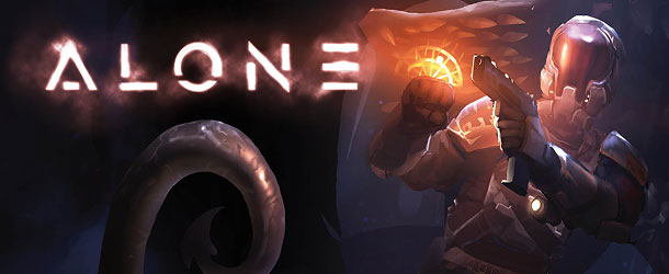
The hero, of course, took a bit more ideation as we needed to nail him right out of the gate. The main look needed to be that of a character with limited strength and assets, out of his element in the midst of this worm-infested base. The few tools and weapons at his disposal, needed to read as being somewhat patchwork, jerry-rigged from various elements in the dark corridors. The helmet was a bit of a challenge, and the initial concept ended up reading too closely to a certain Halo property, but the resulting changes improved it massively. He is a fun character to work with, but I sometimes feel sorry for the abuse he’s gone through in all the artwork I’ve done!
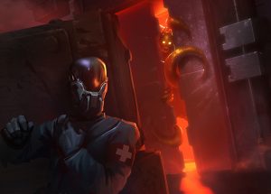
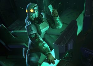
The other characters needed to be visually distinctive, both in silhouettes and color schemes and other elements–hence, the pilot‘s armor being green, the doctor having an overall blue tone, etc. The captain was a bit of a challenge, as her armor was meant to be similar to the main character’s, but the differences are not too subtle for them to read differently. It was also fun to paint them without their helmets, enjoying a moment together, and feeling like a real crew, a real family of sorts thrust into a “horrible” situation.
What about the monsters?
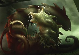
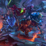
The monsters were a bit of a challenge as well, as the initial concept was already in place when I began concept artwork. A lot of ideation was needed to settle on a final design. In the case of the worm, the maw was working well, but I felt like there was a lack of engagement–just as Ridley Scott’s Alien has its deadly tail, the worm needed more than just a tooth-rimmed mouth. Hence the tentacles, which gave it more presence and immediate threat that at any moment one of those arms might snake out from the darkness.
The parasites were a difficult, too, but we ultimately settled on a design that incorporated some wormlike elements fused with a hard-bodied creature that could both slither and scuttle through the darkness, in ravenous packs.
Anything else you’d like to add?
It has been a pleasure and blessing to work on this project – the direction from Horrible Games was some of the best I’ve ever had the pleasure to work with, and I hope that new possibilities are in store down the line as well. But just as much, I’m looking forward to seeing the game in action, and seeing how others respond to it. Thanks again to the great team at Horrible Games!
Previous articles: Game Overview, The World of Alone, Designers' Diary, Hero Gameplay, Evil Gameplay
* "Discovering Alone" articles were originally published during the first game's Kickstarter project, by Horrible Guild's team.

